tuteMe - Responsive Website
TuteMe is an eLearning app that offers affordable courses for students. The typical user is between 20 – 50 years old and most students are early-career professionals or Job seekers. TuteMe’s aim is to provide a seamless experience for the students to achieve their career goals.

Challenge
TuteMe wanted to make its course enrollment process simpler and effective giving the user an option to experience a hassle-free course selection and checkout process.
Solution
Design a user-friendly app by providing clear navigation and checkout process.
My Role
UX Designer Leading TuteMe Design Team
My Responsibilities
Conducting interviews, paper and digital wireframing, low and high-fidelity prototyping, conducting usability studies, accounting for accessibility, iterating on designs and responsive design
Duration
Sep 2021 – Dec 2021
User Research
I conducted user interviews, which I then turned into empathy maps to better understand the target user and their needs. I discovered that many target users are more focused on Videos that have a duration of less than an hour. Many available websites have course enrollments committed for at least 6 months time frame. Also, I discovered that target users are more likely to enroll if there is a certificate available towards the end of the short courses.

Design Process

User Pain Points
Pain points are any UX issues that frustrate the user and block the user from getting what they need. During the interview, I could capture the major pain points and address those during the ideate phase.
Empathize, Define & Ideate
During the empathize phase, I collected all the insights from user interviews and converted them into personas, followed by user story and then a user journey map

User Persona
I collected pain points that I received during the user interviews and created user personas.

User Journey Map
I created a user journey map of Annie’s experience using the site to help identify possible pain points and improvement opportunities.

Problem Statement
-
How might we make the course selection process quick and intuitive?

Sitemap
Prototype
During the prototyping phase, I sketched out paper wireframes for each screen in my app, keeping the user pain points about navigation, browsing, and checkout flow in mind. Because TuteMe customers access the site on a variety of different devices, I started to work on designs for additional screen sizes to make sure the site would be fully responsive.
Paper Wireframes


Digital Wireframes


Low Fidelity Prototype
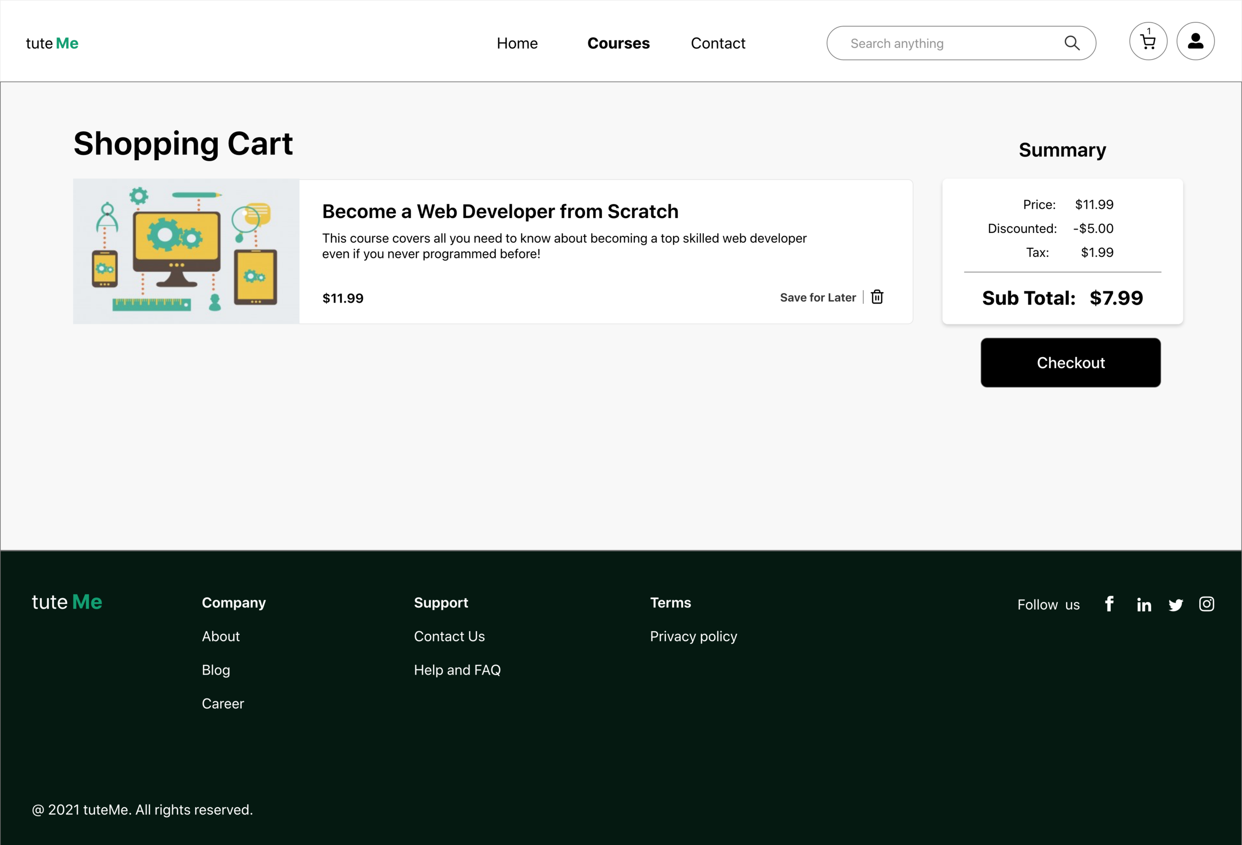
To create a low-fidelity prototype, I connected all of the screens involved in the primary user flow of adding a course to the cart and checking out.
At this point, I had received feedback on my designs from members of my team about things like placement of buttons and page organization. I made sure to listen to their feedback, and I implemented several suggestions in places that addressed user pain points.

Usability Study
The user wanted to have a primary action button from the homepage to view courses
The user wanted to save the order for later
The user wanted to have a global search

Based on the insights from the usability study, I made changes to improve the site’s overall flow.
One of the changes I made was adding the option to add the global search at the header
Added SAVE for Later option as a feature to the cart

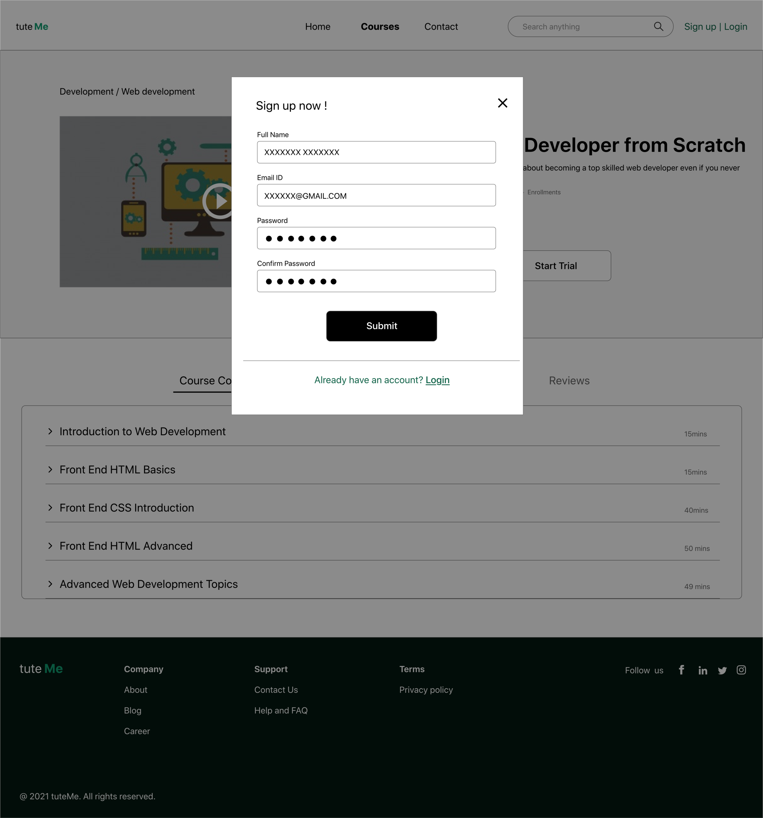
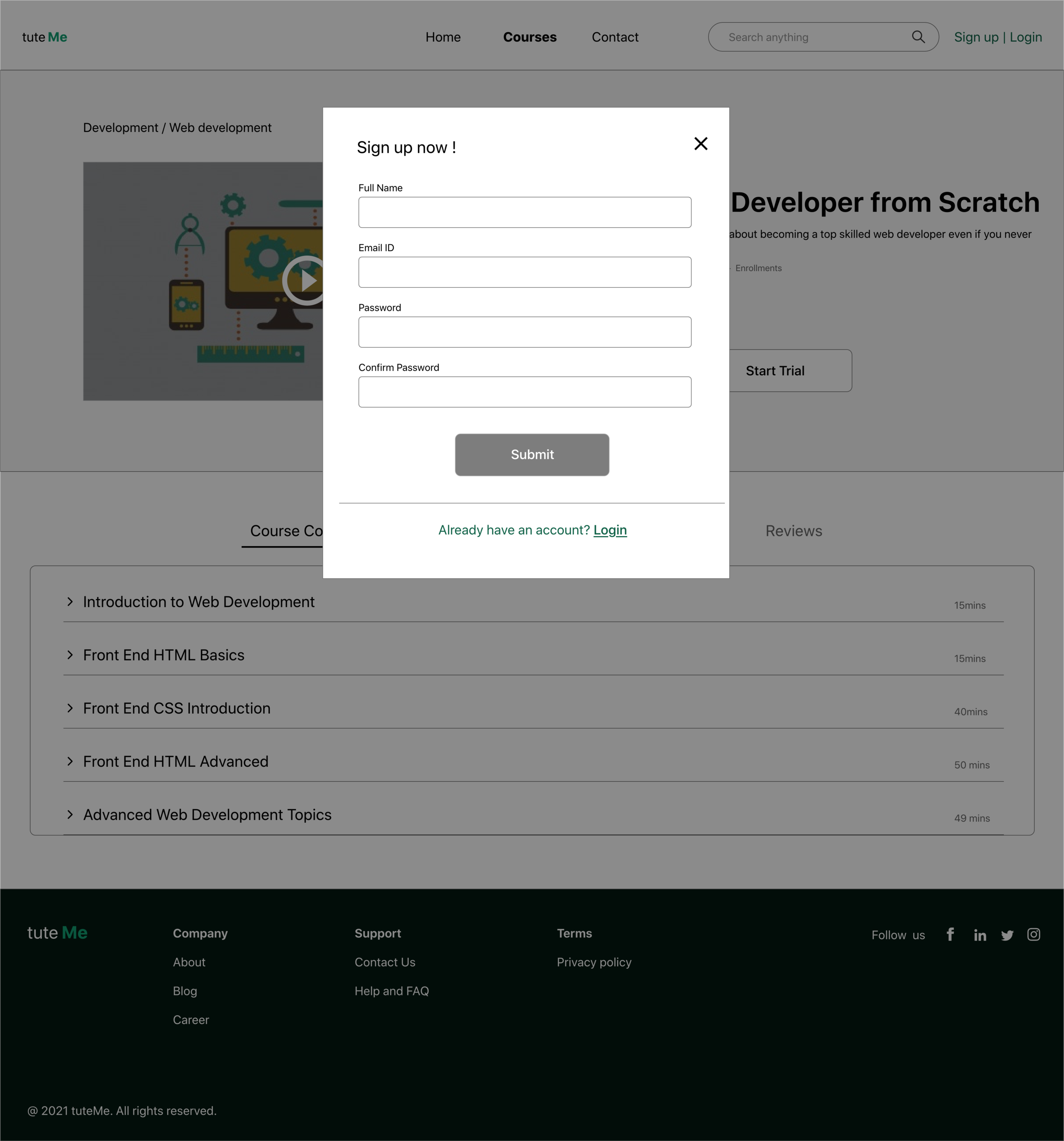
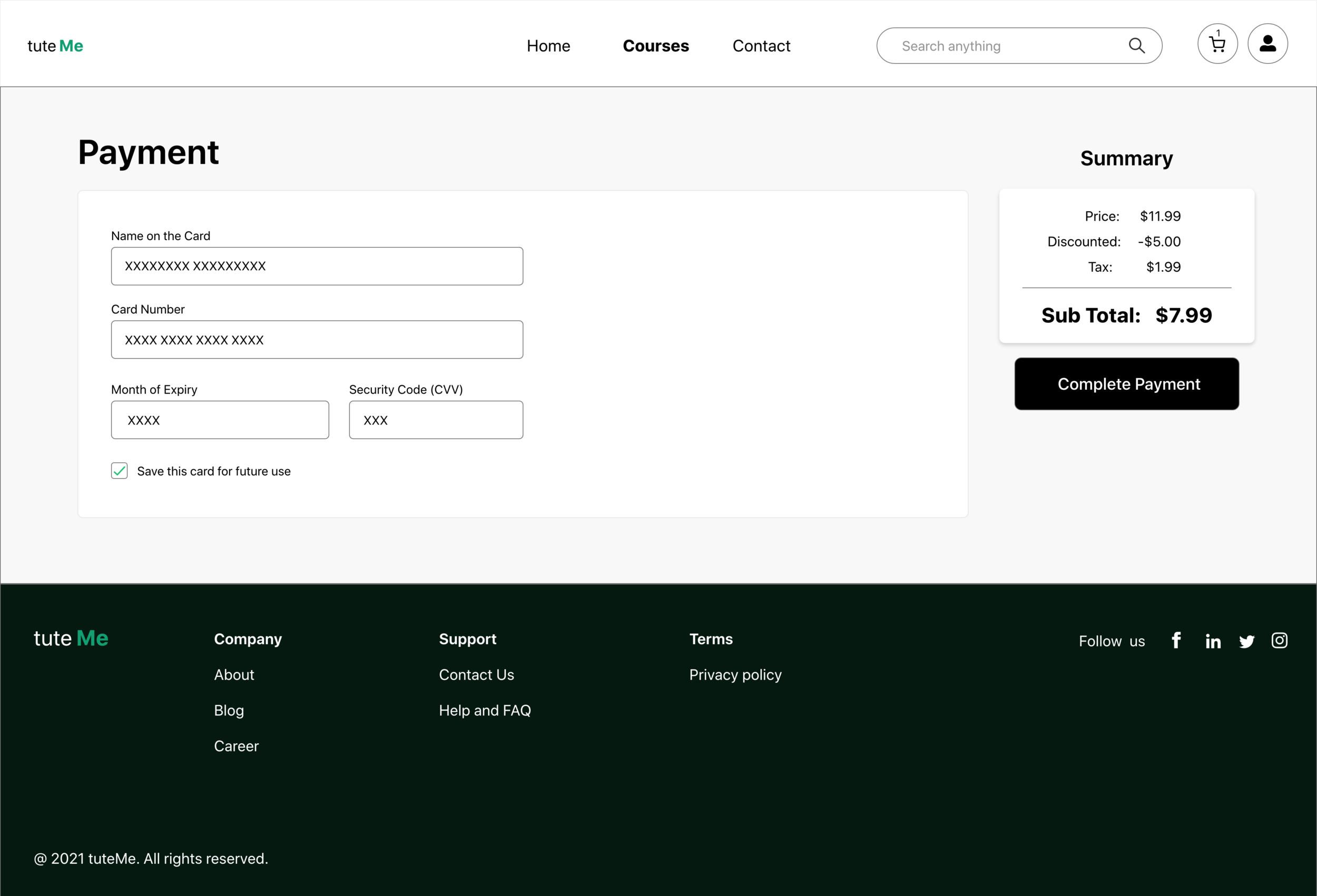
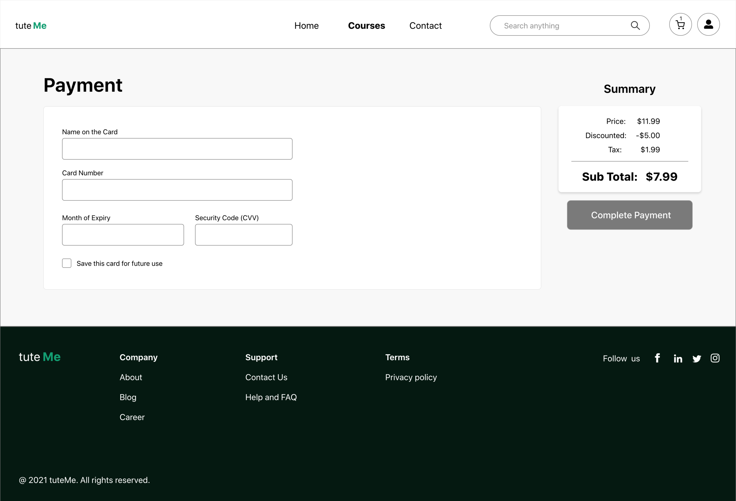
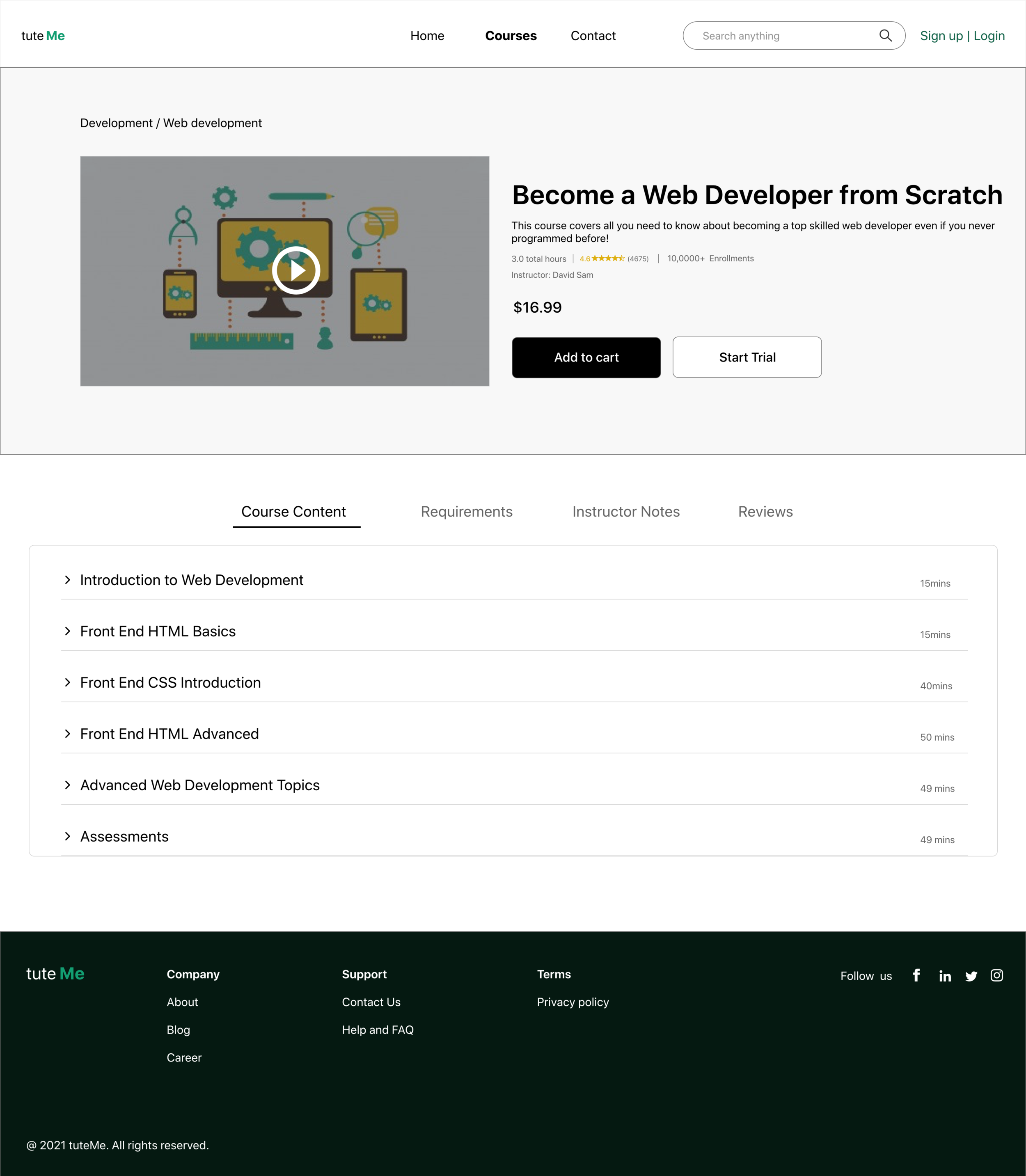
High Fidelity Prototype
My hi-fi prototype followed the same user flow as the lo-fi prototype and included the design changes made after the usability study, as well as several changes suggested by members of my team.

Accessibility Considerations
I used headings with different sized text for a clear visual hierarchy
I used landmarks to help users navigate the site, including users who rely on assistive technologies
I designed the site with alt text available on each page for smooth screen reader access
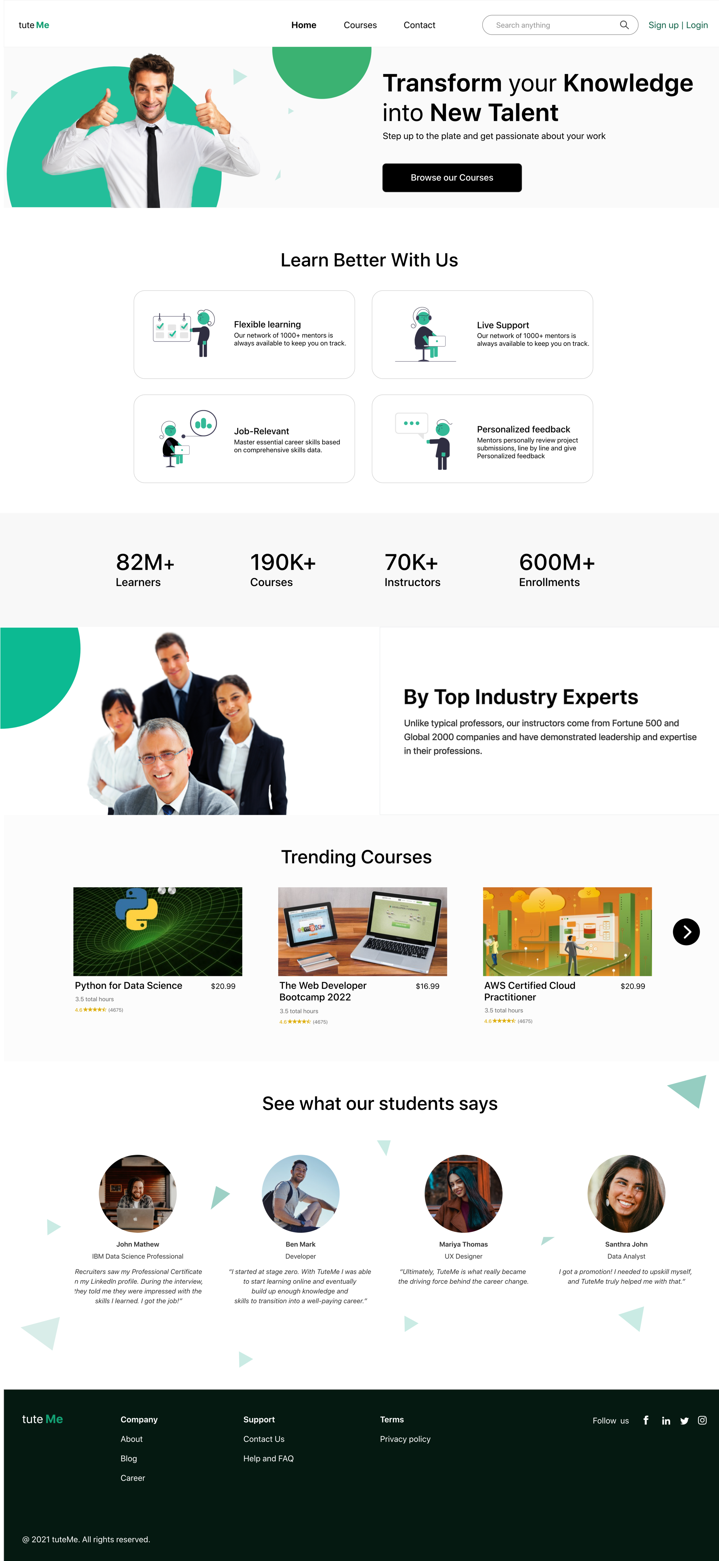
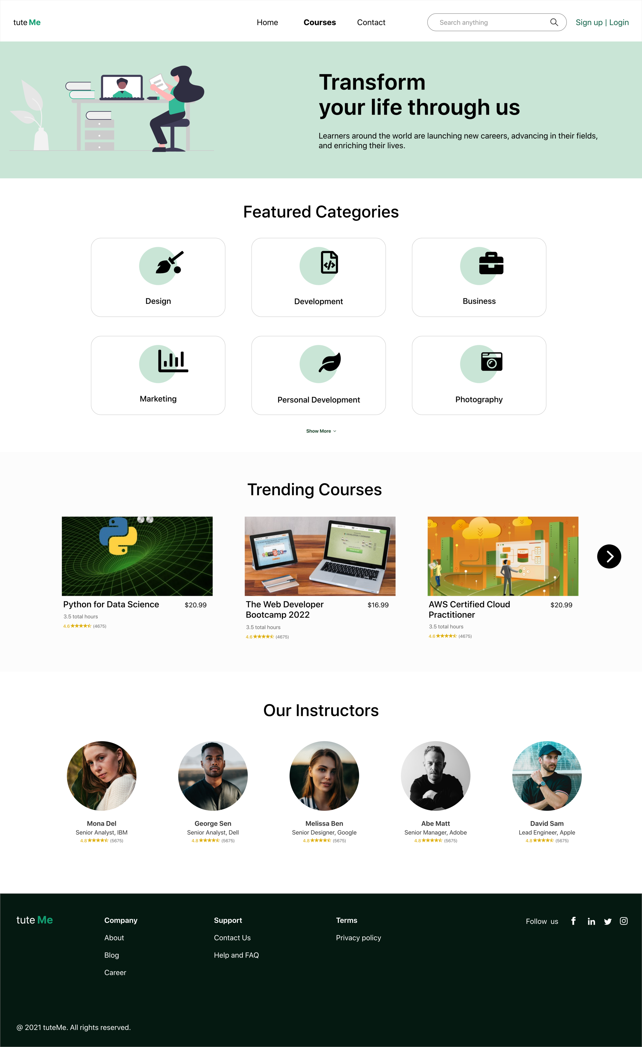
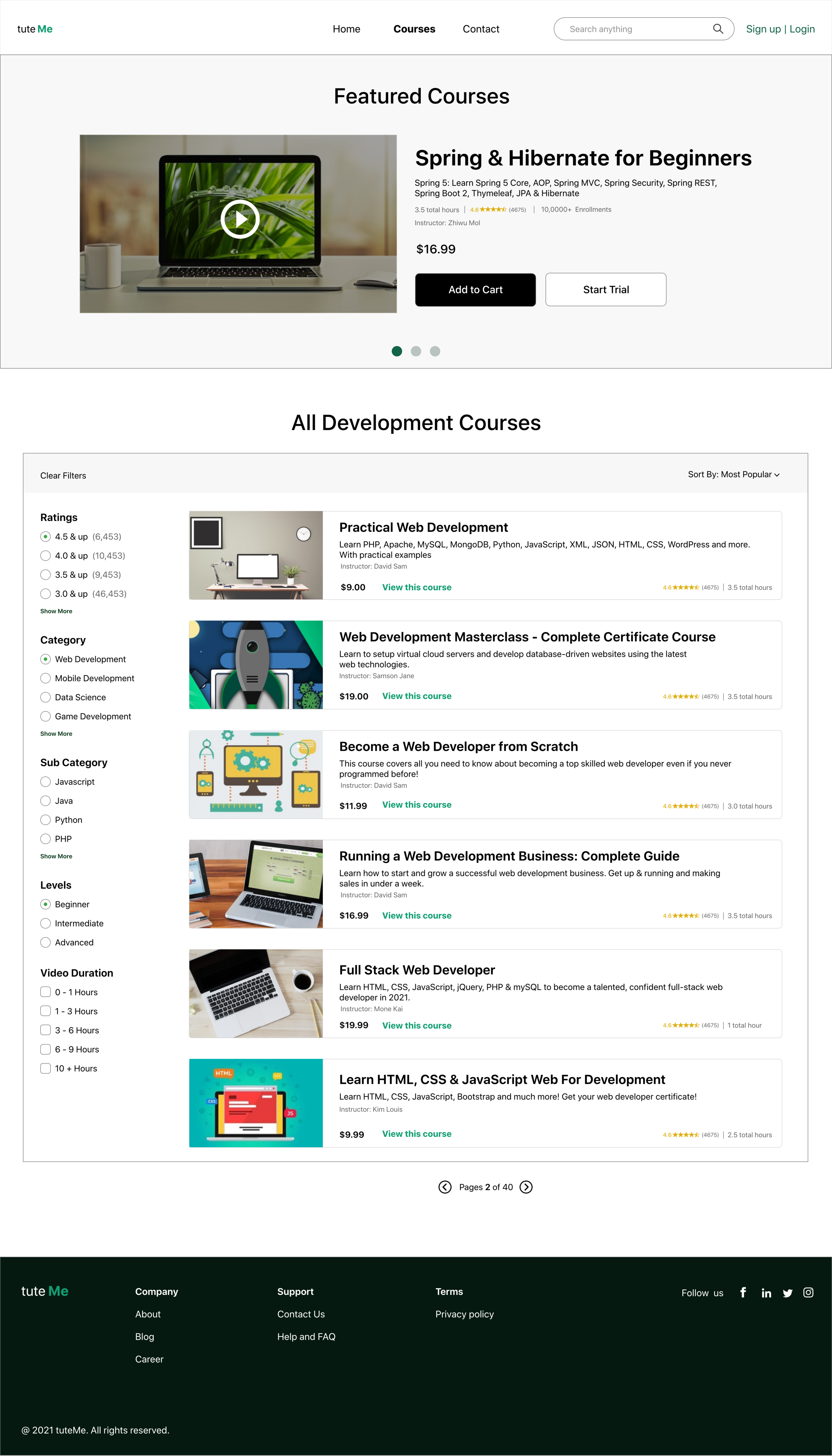
Design Preview
I included considerations for additional screen sizes in my mockups based on my earlier wireframes. Because users access from a variety of devices, I felt it was important to optimize the browsing experience for a range of device sizes, such as mobile and tablet so users have the smoothest experience possible.
Key Takeaways
Impact:
Our target users shared that the design was intuitive to navigate through, more engaging with the images, and demonstrated a clear visual hierarchy.
What I learned:
I learned that even a small design change can have a huge impact on the user experience. The most important takeaway for me is to always focus on the real needs of the user when coming up with design ideas and solutions.