Mom’s Kitchen - Restaurant App
Mom’s Kitchen is a local Indian restaurant located in the suburbs of a metropolitan area. Mom’s Kitchen strives to deliver good quality Indian food with all its flavors and with the best customer experience
Challenge
To provide the best customer experience for the busy workers to order the food online and also to provide reservation facility for dining in.
Solution
Design an app for Mom’s Kitchen that allows users to easily order and pick up fresh Indian healthy dishes and also to allow reservations for dine-in.
My Role
UX designer designing an app for Mom’s Kitchen from conception to delivery
My Responsibilities
Conducting interviews, paper and digital wireframing, low and high-fidelity prototyping, conducting usability studies, accounting for accessibility, and iterating on designs
Duration
May 2021 – August 2021
User Research
I conducted interviews and created empathy maps to understand the users I’m designing for and their needs. A primary user group identified through research
was working adults who don’t have time to cook meals. This user group confirmed initial assumptions about Mom’s Kitchen customers, but research
also revealed that users had frustrations during the cancel order process. Users are even concerned about the seating during the dine-in.

User Pain Points
Empathizing Phase
During the empathize phase, I collected all the insights from user interviews and converted them into personas, followed by user story and then a user journey map

User Persona

User Persona

User Journey Map
After combing through user needs, I had mapped out the possible journeys users would be taking through the app. Mapping John’s user journey revealed how helpful it would be for
users to have access to a dedicated Mom’s Kitchen app.
Defining Phase
Based on all the points that I have collected so far, I was able to analyze my observations and synthesize them in order to define the core problems that I had identified at this point, which then turned into an actionable design problem statement.

Problem Statement
Ideation Phase
An audit of a few competitors’ products provided direction on gaps and opportunities to address with the Mom’s Kitchen app.

Competitive Analysis
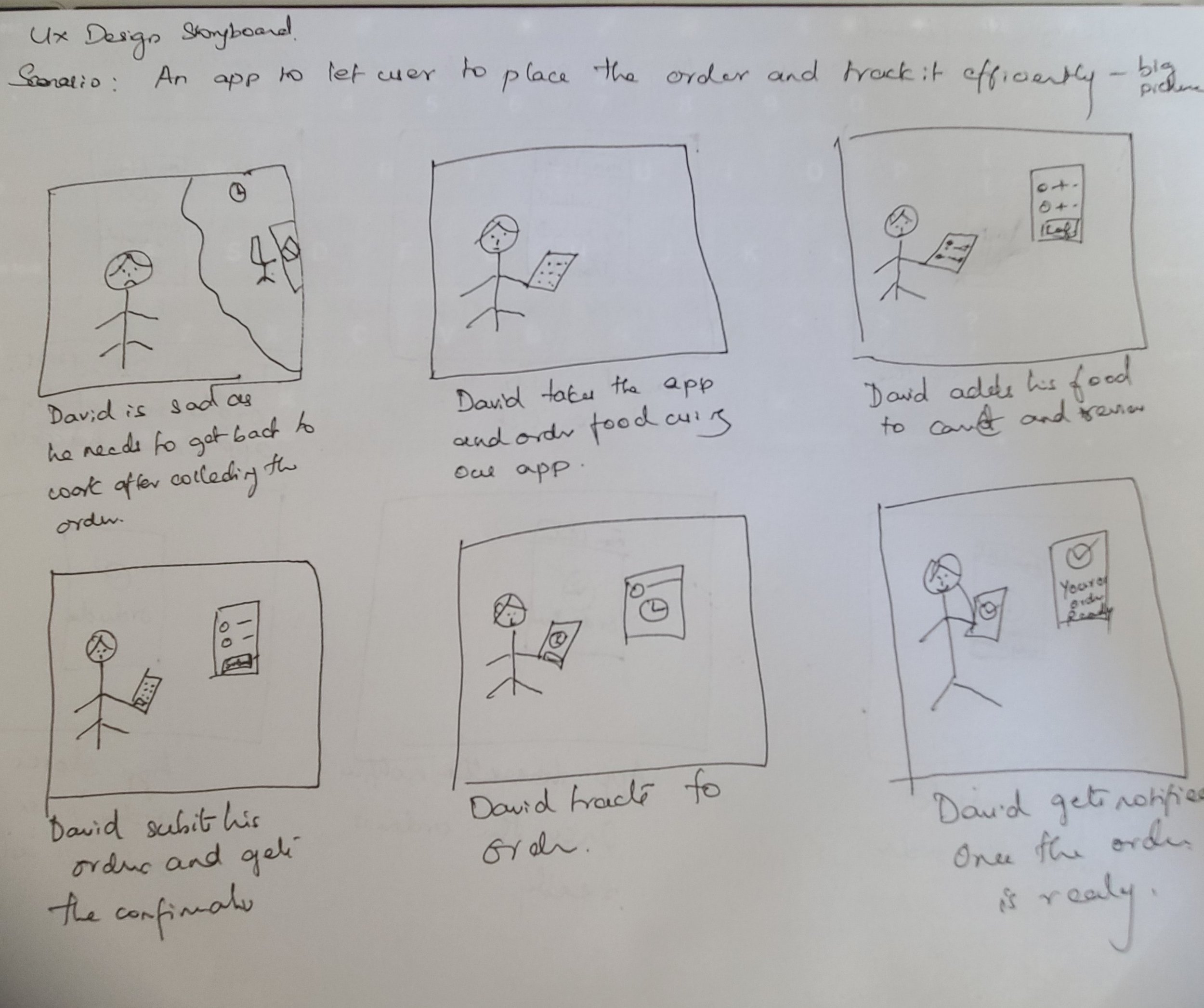
Story Board - Big Picture
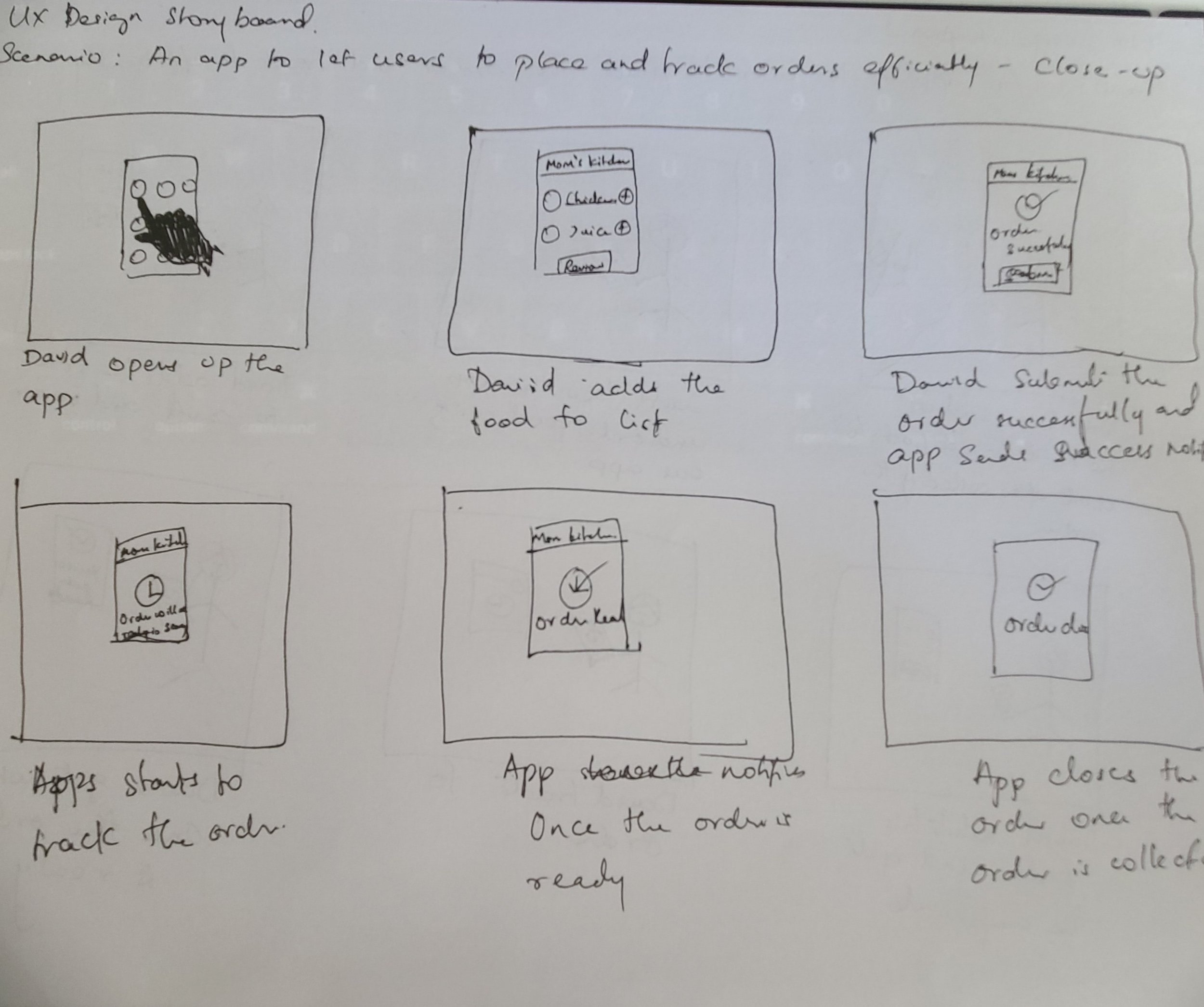
Story Board - Close Picture
-
How might we make the food checkout process quick and intuitive?
Visual Explorations
Taking the time to draft each screen of the app on paper ensured that the elements that made it to digital wireframes would be well-suited to address user pain points. For the home screen, I prioritized a quick and easy ordering process to help users save time.
Paper Wireframes

Digital Wireframes


Low Fidelity Prototype
Using the completed set of digital wireframes, I created a low-fidelity prototype. The primary user flow I connected was ordering food, so the prototype could be used in a usability study.
Usability Study
I conducted two rounds of usability studies. Findings from the first study helped guide the designs from wireframes to mockups. The second study used a high-fidelity prototype and revealed what aspects of the mockups needed refining.
Round 1 findings
Users wanted to see the confirmation
Users wanted to have easy navigation
Users wanted a reservation option
Round 2 findings
The date field was confusing
The user wants to include the seating option
Need an option to cancel the order after ordering

Mockups
Based on the feedback from the usability study I made changes to the Data of Booking and Time of Booking

Added Cancel Order based on the feedback from usability study

High Fidelity Prototype
The final High Fidelity Prototype displayed the clean user flows for ordering food and reservations.

Accessibility Considerations
Provided access to users who are vision impaired through adding alt text to images for screen readers.
Used accessible colors
Used detailed imagery for food to help all users better understand
the designs.
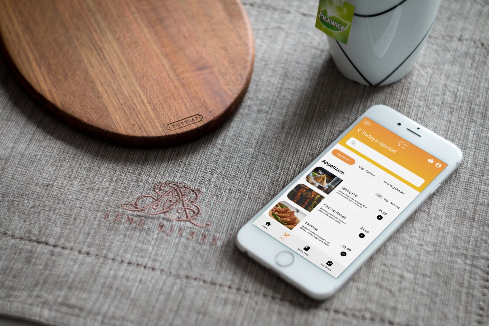
Design Preview
Conducted another round of usability studies to validate whether the pain points users experienced have been effectively addressed. Refined the high fidelity mocks based on the user feedbacks.

Style Guide

Key Takeaways
Impact:
Our target users shared that the design was intuitive to navigate through, more engaging with the images, and demonstrated a clear visual hierarchy.
What I learned:
I learned that even a small design change can have a huge impact on the user experience. The most important takeaway for me is to always focus on the real needs of the user when coming up with design ideas and solutions.