GoldAGE - Mobile App with Responsive WebApp
Gold AGE is a service app targeting the Elderly people of a community-based in California. The app primary focuses on getting the needy things to the elderly people at their doorstep

Challenge
During my research, I found that our community has elderly people who stay alone or with their spouses far away from their kids. They are in need of medicines, groceries, cleaning services but they couldn’t find everything in one place.
Solution
Design an app to create that one-stop-shop feel for these elderly people and to help them get their needy things through this service.
My Role
UX designer leading the app and responsive website design from conception to delivery
My Responsibilities
Conducting interviews, paper and digital wireframing, low and high-fidelity prototyping, conducting usability studies, accounting for accessibility, iterating on designs, determining information architecture, and responsive design.
Duration
Oct 2021 – Dec 2021
User Research
During my research, I found that our community has the majority of elderly people who stay away from their kids. They either don’t know to drive or they are too old to go out. They try to get the needy things through the next-door neighbors who are young, or their kids try to order the things through individual apps. I learned that our community needed a service which is a single shop stop for the neediest items. I also learned that the app should be very simple and easy to be used by the elderly people

User Pain Points
Empathize, Define & Ideate
During the empathize phase, I collected all the insights from user interviews and converted them into personas, followed by user story and then a user journey map

User Persona

User Persona
Based on all the points that I have collected so far, I was able to analyze my observations and synthesize them in order to define the core problems that I had identified at this point, which then turned into an actionable design problem statement.

Problem Statement
With all the insights collected during the empathy and define phase, I did a quick ideation exercise to come up with ideas on how to address gaps identified in the research. My focus was specifically on having a single shop stop for all the needy services. I used crazy eight and “how might we” questions to address the user's needs.

Crazy Eight Technique
Prototypes
After ideating and drafting some paper wireframes, I created the initial designs for the Gold AGE app. These designs focus on giving a simple and intuitive user experience to the users to get their needy items.
Digital Wireframes


Low Fidelity Prototype
To prepare for usability testing, I created a low-fidelity prototype that connected the user flow of viewing an item and scheduling the delivery
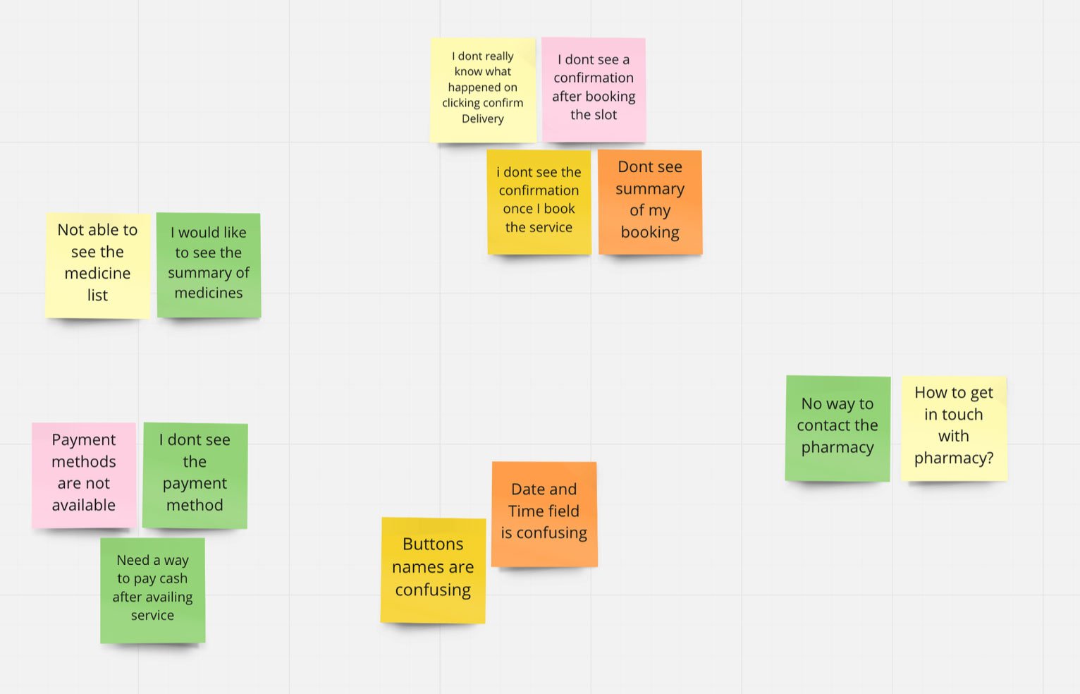
Usability Study
During the usability testing, I could collect more insights regarding the user flow.
The user couldn’t remember the pharmacy address
The user wanted an option to get both prescribed as well as over the counter medicines
Couldn’t find the address and insurance details

Mockups
Based on the insights from the usability studies, I applied design changes like
Providing options for prescribed and over the counter medicines
Editing the insurance details
Based on the study, introduced a new screen with a list of pharmacy details.

High Fidelity Prototype
The high-fidelity prototype followed the same user flow as the low-fidelity prototype, including design changes made after the usability study.

Accessibility Considerations
Clear labels for interactive elements that can be read by screen readers.
Used accessible colors
Images are supported with labels.
Design Preview
Conducted another round of usability studies to validate whether the pain points users experienced have been effectively addressed. Refined the high fidelity mocks based on the user feedbacks.

SiteMap
With the app designs completed, I started work on designing the responsive website. I used the Gold Age sitemap to guide the organizational structure of each screen’s design to ensure a cohesive and consistent experience across devices.

Responsive designs previews
The designs for screen size variation included mobile, tablet, and desktop. I optimized the designs to fit specific user needs of each device and screen size.

Key Takeaways
Impact:
Users shared that the app was really helpful for the aged parents to get their things at the doorsteps
What I learned:
I learned that even though the problem I was trying to solve was a big one, diligently going through each step of the design process and aligning with specific user needs helped me come up with solutions that were both feasible and useful.