Vclean Services - Mobile App
This was designed as part of the UX nano degree program. Cleaning is an important aspect of a lively and healthy environment. With today’s busy life schedules people don’t have time to do household chores and spend time with their loved ones. Our team wanted to create a digital product to make user life easy by providing them with the best booking experience.

Challenge
Major products in the market target only a few needs like estimation by a phone call or choosing the existing plan. Our users had different expectations and needs. Collaborating those feedbacks into one single roof was a real challenge.
Solution
Design an app for Vclean services that focuses mainly On customizing the scheduling needs, Enrollment plans, etc.
My Role
UX designer designing an app for Mom’s Kitchen from conception to delivery
My Responsibilities
Conducting interviews, paper and digital wireframing, low and high-fidelity prototyping, conducting usability studies, accounting for accessibility, and iterating on designs
Duration
Sep 2020– Dec 2020
Discovery: Research & Analysis
During the research phase, we found that most of our users were frustrated with either the app or the cleaning service. They had different preferences and needs. We interviewed 5 people who use the digital app for booking the services. We observed their pain points and difficulties by getting proper information through Several Other apps.

Based on the user interviews, I created the affinity mapping and then plotted down the themes and opportunities.
Things to consider:
Users are from different age groups and they have different needs.
Users should be able to see the progress of cleaning which would help them to utilize this time for their personal needs.
Improved Payment methods

Themes and opportunities
Empathizing Phase
During the empathize phase, I collected all the insights from user interviews and converted them into personas, followed by user story and then a user journey map

User Persona

Feature Prioritizing

User Persona

Login User Flow

Key Findings
Users pain point with the app into consideration
I learned that users are of different age groups. So it should be suitable for all age groups.
One of the participants pointed out that they are not aware of what is happening with the cleaning process
“No Way to know the progress of cleaning” - Participant 3
Users will be motivated if they get a reward system.
“Reward points motivate me to try it again” - Participant 4
One of the participants told me that, without knowing the cleaning process it is difficult to decide what to select.
“I would love to see demo videos before deciding my plan” – Participant 1
As our users are from a different age group we need to consider health risk factors.
“I am allergic to certain cleaning products”’ – Participant 5

Design: Concepts & Sketching
Based on the research, I arrived at a few key insights through the research, user interviews, and surveys.
60% of the users were frustrated with the current booking experiences so they ended up using local services.
Frustrated with the user experience and customer suppor
40% of the users were not happy with the cleaning process, issues with the Pros
They wanted to have the person with whom they had built the trust.
Wanted to know updates while cleaning was in progress.
These insights helped me to focus on key features by doing some initial sketches.
Ideation Phase

Our product should focus on customer satisfaction.
Things to consider:
Users should have the freedom to select what they want.
Budget-friendly Plans should be included.
Ability to customize
Users are from different age groups and they have different needs.
Users should be able to see the progress of cleaning which would help them to utilize this time for their personal needs.
Improved Payment methods
Visual Explorations
Taking the time to draft each screen of the app on paper ensured that the elements that made it to digital wireframes would be well-suited to address user pain points. For the home screen, I prioritized a quick and easy ordering process to help users save time.
Paper Wireframes

Digital Wireframes


Low Fidelity Prototype
Using the completed set of digital wireframes, I created a low-fidelity prototype. The primary user flow I connected was scheduling the cleaning, so the prototype could be used in a usability study.

Usability Study
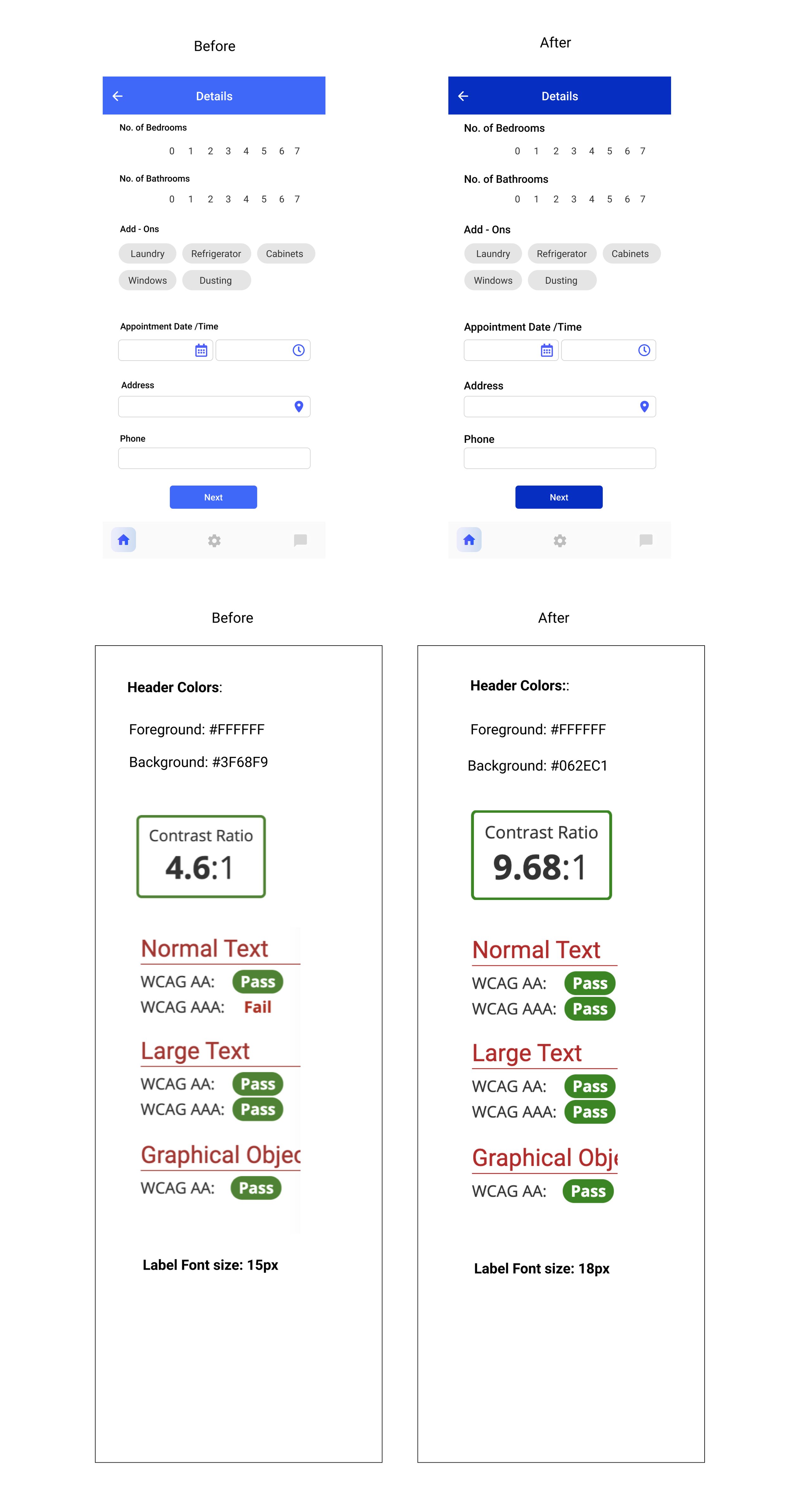
Designs went through multiple iterations based on accessibility feedbacks and user testing.
Based on Accessibility testing, I had to refine the screens with a better color palette and font sizes. Usability feedback helped me to provide the best solutions by preventing the drop-offs in between the booking.

High Fidelity Prototype
The final High Fidelity Prototype displayed the clean user flows for scheduling the cleaning service and managing the booking.

Accessibility Considerations
Provided access to users who are vision impaired through adding alt text to images for screen readers.
Used accessible colors
Used detailed imagery for food to help all users better understand
the designs.
Accessibility considerations
Design Preview
Our final solution helped Vclean Services to get more customers enrolled in their Subscription plan. Users were happy to interact with the smooth Booking Experience.

Screen Preview
Style Guide

Key Takeaways
Impact:
Our target users shared that the design was intuitive to navigate through, interactive with a smoother booking experience.
What I learned:
The most important takeaway for me is to always focus on the real needs of the user when coming up with design ideas and solutions. This project was significantly helpful to know the UX design thinking that focuses on the user and the process from research to testing. I understood that Research is one key element for addressing the problem. I will definitely make use of the experience and what I learned for future projects.